Wednesday, March 9, 2011

Final Project: Suitability Analysis in California

Introduction
Will Grow is a strawberry farmer. He wants to move to a new location in California where he can have optimal conditions for growing his crop. Local government has offered him plots of land in three different regions within the state to set up a new farm: Fresno, Sonoma and Barstow. Before he decides on where to move, a suitability analysis must be done to determine which city has the most favorable climatic and locational conditions for cultivating and selling strawberries.


Strawberries are perennial berries that can provide fruit for many months throughout the year, and for many years after their first planting (StrawberryPlants.org). In 2009 alone, over 2.8 billion pounds of strawberries were produced for a profit of $2.1 billion in the United States (Mann). Over 38, 614 acres of Northern and Southern California farmland is devoted to the strawberry crop, about 66% of total United States production, and an increase of four-fold from the 1970s.

Optimum cultivation specifications require that the area for strawberry planting have an average temperature between 50⁰F and 70⁰F. Strawberries need constant sunlight to produce the largest yields. But the location should also have an average length of daylight less than 14 hours per day and a cool to warm temperature to prevent overheating or drying out the soil (StrawberryPlants.org). Strawberries also require a consistent supply of water to maximize yields each year. Mean precipitation requirements for strawberries are 24-30 inches, though irrigation of about 10 inches during a normal growing season is expected in California to since strawberries need about an inch of water each day during the growing season (Vossen). Any incoming water significantly greater than 30 inches does not improve annual harvest and may actually deter growth because sitting in stagnant water accelerates fruit rot.

By taking into account de facto uses of irrigation within California agriculture, average rainfall, then only needs to be between 15 and 20 inches (total needed – 10 inches of irrigation). Constant irrigation throughout the plant’s reproductive growth stages substitutes for natural rainfall, but the intent of the farmer is to situate himself at a site that requires fewest additional inputs. Therefore, it’s expected that the farmer will want a site that averages in the high end of the spectrum, 18-20 inches of annual rainfall, so that he may use less irrigated water. Strawberries also need relatively flat ground, though a slight slope of 15% or less can help with soil drainage. A slight slope, with ample space for planting, is best for optimizing crop yields. Using these universal cultivation averages for the maximum yield production of strawberries, this report intends to ascertain the locations within California that have the highest potential for berry farming based on temperature, rainfall, slope, proximity to cities and proximity to waste sites.

Methods
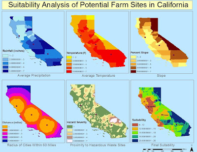
I ascertained annual data values for both precipitation and temperature in California from the state’s Water Resources Board. This climate data was provided by hydrologic region, of which there are ten in California, and then further narrowed by cities within the 58 California counties. The tabular data for these regional values include normal climate totals based on the 1971-2000 time period, in addition to recent monthly totals for temperature. Using this data, I manually created an excel table with information for county name, normal rainfall, and normal climate values which I then joined to the California counties attribute table gathered from the state’s Geospatial Clearinghouse. From this join, mean annual rainfall and temperature totals for each county polygon can be designated. The units for precipitation and temperature were left in inches and degrees Fahrenheit, respectively. See Climate Averages Map.

To evaluate the impact of slope on possible farm locations, I manually input elevation data for the state of California to determine area of high and low slopes. This data was included in the climate data excel table and manually joined to each county. From this information, I was able to use the spatial analyst toolbar to convert the vector slope information into convertible raster data. When the features were made into a raster output, I could use the surface analysis tool to calculate the slope percent for the various counties. See Slope Percent Map.
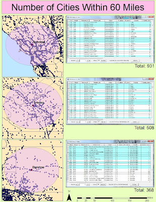
To reduce the natural effects of decay on a recently harvested strawberry crop, berries must be harvested and transported to their location of sale quickly. Quick transport, as assumed by close proximity to cities, also minimizes costs associated with transportation, like fuel. The stipulation for closeness to cities is that they be within 60 miles of the proposed spot for the farm. This number is used as mathematical average for a city that is one hour away based on average road and highway speeds between 50 and 70 miles per hour. Based on the estimated size of the gas tank and miles per gallon for a farmer’s personal transportation truck, about the dimension and capacity of a medium-sized U-Haul truck, the tank can hold 30 gallons of unleaded gasoline with a fuel efficiency of 10mpg (Ninomiya). This volume allows the truck to drive roughly 300 miles without refueling. Having the maximum city market distance at 60 miles allows for the farmer to make two roundtrip drives on one tank of gas. This will sustain a fuel budget at $114, and eliminate superfluous cost from excess driving. To investigate the propinquity of cities to the three suggested locations, I implemented a buffer analysis around the three spots with a maximum distance of 60 miles. From this buffer, I could then select by location all the cities within the buffer distance to determine which city has the best location specs. I also used the line distance spatial analyst tool to provide another look at a buffer of where cities are within 60 miles, with secondary exterior distances of 30 miles, but to do so without all the clutter of the city points. The buffers help delineate the farm site with the most ideal situation in relation to markets. See City Buffer Map and City Proximity Map.


The last of the five maps required finding information from the EPA about national toxic waste facilities. I downloaded a point shapefile with the requisite information, but it was a national shapefile (EPA). I had to clip the shapefile according to the California counties mask so that only facilities in California were shown. Using the clipped points, I could then perform an Inverse Distance Weighted spatial interpolation to determine the variation in toxicity from a dense array of point locations. The IDW output showed the range of facility hazard in terms of an EPA risk scale. See Waste Map.

To then determine the overall suitability of the land in the towns of the possible farm locations, the information from each of the five previous maps were overlaid. To do so, all of the data values were given new scores from 1-7 using the reclassify functionality. The data was reclassified with 1 being the most suitable of the ranges of each of the five maps, and 7 being the least ideal of the maps’ data ranges. Using these new ranges, the values for each component were added together using the raster calculator function in spatial analyst. With an analysis mask of the state of California (using its size and coordinate system for the output of the analysis technique) the calculator function combined the five datasets and superimposed the resulting symbology over the state shapefile. The new map provides an encompassing examination of farm suitability, based on location, within California. With the city points appearing on top of the new suitability map, Will Grow can make an educated decision about where to move.

Results
The most suitable locations are in the lower end of the new range, where 9 is best and 26 is least suitable. According to the new scale that takes into account each component, Sonoma appears to be in the 9-12 range, making it the most ideal site, with Fresno coming in second and Barstow in third.
Conclusion
In looking at the individual factor maps, and the subsequent total suitability map, Will decides to accept the farm plot in Sonoma. Sonoma has average rainfall values of 18-22 inches, and a mean temperature of 59⁰F. It is also situated on mostly continuous flat terrain, and has over 900 cities within a 60 mile radius. Will’s decision is also in accordance with the regional crop database provided by the California Pest Management Center. The database offers a comprehensive list of crops grown in California based on various regions. In region 7, which includes Del Norte County, Sonoma County, Humboldt County, etc., dozens of crops are successfully grown, including strawberries. It is not the only growing region suitable enough to grow the strawberry crop, but it is the most productive. The city of Sonoma is, of course, in Sonoma County, putting the location of Will’s farm in the area of highest potential strawberry cultivation.


California Pest Management Center. “California Commercial Crop Database.” 2 March, 2011. http://www.wrpmc.ucdavis.edu/ca/cacrops/region4.html.

State of California. “Boundaries.” GIS Cal-Atlas Geospatial Clearing House. 14 Nov, 2008. Accessed 2 March, 2011. http://www.atlas.ca.gov/download.html

State of California. “Society.” GIS Cal-Atlas Geospatial Clearing House. 14 Nov, 2008. Accessed 2 March, 2011. http://www.atlas.ca.gov/download.html

State of California. “Regional Climate Data.” Department of Water Resources. 3 Feb, 2011. Accessed 2 March, 2011. http://www.water.ca.gov/floodmgmt/hafoo/csc/

Ninomiya, Kent. “What is the Gas Mileage of a U-Haul Truck?” 14 Feb, 2011. Accessed 2 March, 2011. http://www.ehow.com/about_4587090_gas-mileage-u_haul-truck_.html.

“Growing Strawberries.” StrawberryPlants.org. Accessed 12 March, 2011. http://strawberryplants.org/2010/05/growing-strawberries/.

Vossen, Paul. “Growing Strawberries on the North Coast.” Accessed 12 March, 2011. http://cesonoma.ucdavis.edu/files/62257.pdf.

Mann, Albert R. “US Strawberry Industry.” United States Department of Agriculture. March 2010. Accessed 2 March, 2011. http://usda.mannlib.cornell.edu/MannUsda/viewDocumentInfo.do?documentID=1381.

US Environmental Protection Agency. “EPA and State Treatment, Storage, Disposal.” February 2011. Accessed 8 March, 2011. .

Tuesday, March 1, 2011

Lab 8: Spatial Interpolation


Spatial interpolation is an assistive tool that plays an integral role in analyzing surface information from both vector and raster files. The interpolation techniques used in this lab, in conjunction with rainfall data provided by the Los Angeles Department of Public Works, shows the variation and trends in current and past precipitation patterns. Not only can these maps display the difference between the current seasonal rainfall total and the normal seasonal rainfall prediction, but they provide a comparison between distinct types of spatial analysis.


According to the hydrology maps provided by LADPW, the data calculated for precipitation is done between October and March, for both seasonal and normal (expected) seasonal values to provide more accurate comparisons in present and past precipitation patterns in LA. By examining the generated maps, the variance between normal and seasonal values is mostly minimal in the areas of low to moderate annual rainfall, like in the most northern and southern regions of Los Angeles County. Towards the interior and far west, near Cogswell Dam and Agoura, however, the discrepancies in past and current values is more pronounced, where the rainfall data measured for this season is about 8 inches higher tha the normal seasonal values. The inverse can be said for Sanbarg Airways where seasonal rainfall is roughly 10-15 inches shy of the normal range. These insights come from the probative use of spatial analysis to present and compare the datasets using both the IDW and Regularized Spline techniques.


I chose the Inverse Distance Weighted function because of its ability to manage a dense array of points. In doing so, it can extrapolate the surface variation, which is a key geographic factor in rainfall intensity. And because points in close proximity to each other have influence over the others' output values in IDW, it's helpful in analyzing the similarities of rainfall patterns and extents at gauges near one another. The second interpolation tool I used was the Regularized Spline. This method generates a smoother surface through the use of several slope derivative calculations. From these calculations, a more precise interpolation can be done because the spline technique passes directly through the data points. I initially decided on this spline method because it is said to be the best at representing smoothly varying phenomena like temperature, and the continuity of temperature seems much akin to rainfall (Childs, 3). In using both functionalities, I came to the conclusion that spline was much more accurate in its data calculations and led to a more precise comparative result.

Tuesday, February 15, 2011

Lab 6: Suitability Analysis


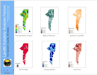
The Central Valley Landfill in Kettleman City, CA is surrounded in more controversy as it looks to expand further into surrounding farm communities. Senators Boxer and Feinstein are trying to postpone the expansion until research can be done into the possible linkages between the location of the state's largest landfill and birth defects and environmental pollution in the nearby towns. The use of spatial analysis in GIS can help determine the "suitability" of the land on which the landfill proposes to grow, both for the safety of the people and for the function of the facility to hold over "400,000 tons of waste" (data for 2009) including materials containing cancer causing PCBs.


Studies have been conducted in the towns adjacent to the landfill, and researchers from the Department of Public Health concluded that the frequency of birth defects has no direct tie to the proximity of the landfill. This claim that birth defects are "not higher than expected" rides on the back of several reports stating that the large landfill is improperly maintained. The water supply in those cities alone is known to contain elevated levels of arsenic, though its cause, whether from overuse of pesticides in farming or the landfill's toxic holdings, is unknown. Although it seems to be a near consensus by state agencies as to the lack of a correlation to health issues and the landfill, citizens of the towns and Senator Boxer aren't set on believing the results. Locals are already concerned with their exposure to pollutants from their agrarian environment, as well as their poor water supply, but with the constant influx of hazardous waste into the Central VAlley Landfill, the concern is exacerbated and needs to be fully and directly addressed.


The people of Kettleman City need clearer and more succinct data. Its unlikely that a high number of birth defects or various other health issues is completely independent of the nearby landfill that has accrued numerous safety violations for improperly operated waste ponds and unusually high levels of radiation. With state agencies conducting studies without much of their knowledge and with vague results that eliminate them from blame, it's reasonable to see why there is so much mistrust and concern from local farmers. The data Feinstein and Boxer's teams need to gather needs to be of higher quality, and regarding the main factors of concern, like toxic leakage from the dump and where it's ending up in the surrounding land. With better information from focused research teams, GIS can be implemented to consolidate this data into easily understandable formats, like the six maps created in the tutorial.


These maps can pinpoint the drainage of the soil around the landfill and the externalities of that drainage of waste effluent on the land it seeps into, as well as the possible zones of contamination in regards to arsenic or PCB materials overlaid on maps of the city of county. These would allow a format to display the data publicly, thus allowing for critique and review of the research. And the conciseness of the data into a color coded map of a land parcel with which the people are familiar will provide all the people of Kettleman City with an understanding of the results.


Such spatial analysis lays evident the egregious faults of the landfill, but also the natural offenders aiding in the threat, like slope percent and land cover types. This information, gathered from GIS raster and spatial analysis, can help people make informed decisions about where to live, work, play. It'll also help Boxer and Feinstein make the decision about whether they will allow the landfill to expand its site and capacity further into the communities on which it borders. GIS is a valuable tool here, not solely for the administrators of this project, but for the people who voice real concerns and demand real answers to the alarming health problems in their communities. Here's to hoping the moratorium provides time to gather more conclusive results for the EPA and the people of Kettleman City to determine whether a 3.2 mile expansion could pose a severe health risk to the surrounding community. And when the numbers are all measured, GIS can be a more than capable tool in the calculation and presentation of correlations and relationships between variables and outcomes.

Saturday, February 5, 2011

Lab 7: Using Raster Data

I do not enjoy raster data. I do not enjoy the conversion to raster data, and the spatial analysis of such data is rife with obstacles and difficulties. But it's understandable that having such skills in one's ArcGIS arsenal is valuable and produces informative results. Yet even with the aid of the tutorial, which in itself needed more detail in its numerous spatial conversions, manipulating and analyzing new data was an arduous task to say the least.


I don't think I fully grasped the extent of the methods necessary for using raster data, and I found myself only implementing two or three of the exercises that were utilized in the tutorial. That could be an error on my part, though I feel that the great lengths the WUI map went to was to provide a complete overview of raster data, wherein much of my data was already in a raster/grid format. I got the majority of my shapefiles from the Fire and Resource Assessment Program's website, which provides detailed information about fires and their extraneous causes and effects for the state of California. I was a bit befuddled by some of the available data, as to what kind of information it would provide me, but found that what I chose seems to have fit into the parameters that I required. I thought that once I found the data I needed (not as easy a task as it would seem) making the map would be simple. I had made a map in a previous class that required a DEM for the Station fire already! But this lab didn't offer such a simplistic mathod of mapping. At times I was aggravated by the seemingly unreasonable mismatch of data that I had tried to manipulate using features from the Spatial Analyst toolbar.

Although I feel that I may need a separate course just to learn the various techniques involved in the usage of raster data, this lab seems to be a good introduction to the process. The tutorial has everything ready for the user, and knows the attributes and fields to change and join. With my own data, compiled from various sources, changing and converting data was much more confusing and complex. I found myself having to pore over the tutorial trying to find hints as to how to solve my own data problems, and while I feel that for the most part I resolved those issues, there may still be mistakes I have yet to correct. But overall, the hazards map seems to be indicative of the correct information- that on higher slopes and with denser vegetation (high fuel rank), there is greater risk of a fire, which is clearly evinced in the map. The results seem to justify the means, a bit, though I feel the time and frustration put into a roughly pieced together map does not make me want to use much raster data in the near future.

Wednesday, February 2, 2011

Quiz #1


In January of 2010, Los Angeles City Council members voted to implement an ordinance that would prohibit marijuana dispensaries from setting up in locations within 1000 feet of schools an parks. Though the reasoning for the regulation is lacking in factual support, it will nonetheless affect the hundreds of dispensaries that appeared during the 2007 "Green Rush." As the map clearly shows, all of the demarcated dispensaries in the Los Angeles City area will have to relocate due to the new stipulations. Even with a personal opposition to marijuana use, the ordinance is an unjust regulation imposed upon a business that carries an assumed negative stigma.

The marijuana ordinance's numerous rules will discourage a new source of economic activity in Los Angeles. The mandate will not only force out the majority of current dispensaries, but will force a cap at 70 dispensaries within the city's limits. These operational dispensaries are further subjugated to a financial stranglehold in which they are not allowed to profit from marijuana sales, and are forced to close at or before 8pm to eliminate the criminal activities of the "late night pot scene." Allowing marijuana dispensaries to technically be legalized under California state law, but then forcing them into a narrow box by which they can operate is significantly reducing the valuable tax money the state and city can use for more beneficial aims.

While council members make it appear the the dispensaries are linked to increases in neighborhood crime, the data to corroborate that assumption is minimal. While these pot shops may be a blight to those that live near the location, it is really up to police to patrol these areas for the rare instance of criminals under the influence. While there should be careful patrol of the relationship between dispensaries and possible school aged buyers, the ordinance is unfair to the dispensary purveyors following California state law, and is a dismal choice for the state economically as well.

Tuesday, February 1, 2011

Lab 4: Digitizing


The use of heads-up digitizing is a valuable tool that allows users to create their own primary data sources in ArcGIS. By finding an image from a pre-existing source, as we did with the map of 1999 Iraq from the University of Texas' Map Library, it was easy to make shapefiles to correspond to the geographical features portrayed on the image. And by creating these new shapefiles from scratch, not only were they given individual names and IDs for our later use, but we could specify, and sync, their coordinate systems to make future use of the digitized data function more smoothly.
The process of digitizing, while simplistic, is tedious and requires steady focus and concentration. To create accurate shapefiles in the likeness of Iraq's provinces, cities and rivers, careful and precise editing must be done to the existing map picture using a trace tool. The task sounds easy enough, but even basic map designs such as this require some painstaking effort. It can be immensely difficult to determine the exact locations of bends in a river or curves in a provincial polygon, especially when zooming in only shows the blurred pixels of the original image. Tracing the international border of Iraq was quick, but making the provinces within by cutting the polygon was a bit of a nuissance. The polygons snapped to the border and completed themselves for the most part which was easy enough, but because they had been cut from the larger Iraq polygon that polygon had to be remade and reimposed onto the map around the new provincial polygon shapes.
The process of digitizing is a crucial skill for GIS users because it helps to create new sources of information where there had been none previously. Even though images of the locations may already exist, digitizing has allowed the creation of new point, line and polygon shapefiles, available for use in the creation of new maps (as seen above). From simple tracing, and naming, of objects in an image, new data sources are created and accessible for use, making mapping as simplistic a process as adding the data and giving it a title. My hope is that we practice this technique more so that we can hone a skill which can eliminate needless failed attempts at "downloadable shapefile" research and allow us to just create the spatial data we require for later mapping assignments.

Tuesday, January 25, 2011

Lab 3: Geocoding


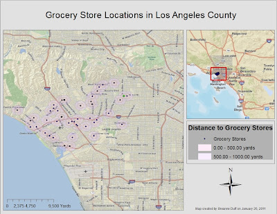
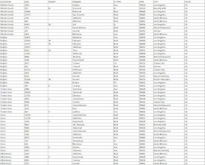
My goal was to create a map that could be used to determine the distance of a residence to the nearest grocery stores. Close proximity to grocery stores is an integral factor in deciding where to live. The store itself can be an influencing factor, and can also be seen as an indicator of a neighborhood's economic demographics. For instance, Whole Foods grocery stores often carry "organic" food products that are priced higher than food products sold at Albertsons; the presence then of a Whole Foods market can not only garner or deter affinity for the area from prospective buyers, but can often be used as a gauge for an area's relative affluence. After determining the addresses of 50 different grocery store locations in Los Angeles County, I was able to compile a spreadsheet in Excel to be used for importing and joining in ArcGIS.


Geocoding is an incredibly useful tool to help represent specific point locations on maps with road features, or even those that have polygon shapefiles. With the geocoding application, creating a map with address details is a much faster process than if the user had to hunt and peck for places on far ranging maps. The address locator assimilated my hand built address table into the attribute table of my roads layer to match them up and provide the recognized locations with individual points. From there, I created buffers for each point to show the relative distance around the store. These buffers would then give current or prospective homeowners/renters an idea of grocery store chains adjacent to their residences, as well as approximately how far (in yards) those stores were from their homes.


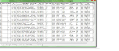
While the geocoding tool is incredibly useful for matching and labeling points on ArcGIS maps, it can be tedious, and gathering all the right components can be difficult. Whereas manually inserting addresses into a layer's attribute table would be arduous, creating a spreadsheet in Excel is no easy task. Inputing each store name, address, zip code, etc...can be a painstaking process, espcially when each column name must be identical to the corresponding names in the layer attribute table, and when addresses need to be broken down by each component, from building number to street type (Rd, Ave, Blvd). I tried numerous times to join my spreadsheet to the attribute table only to find all my columns were "Null." And (after making and) using an address locator, any unmatched or tied data must be parsed out and fixed before geocoding can be completed. But geocoding did help to discover where grocery stores can be found in LA County and their relative distance to each other and surrounding neighborhoods.