Tuesday, February 15, 2011

Lab 6: Suitability Analysis


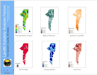
The Central Valley Landfill in Kettleman City, CA is surrounded in more controversy as it looks to expand further into surrounding farm communities. Senators Boxer and Feinstein are trying to postpone the expansion until research can be done into the possible linkages between the location of the state's largest landfill and birth defects and environmental pollution in the nearby towns. The use of spatial analysis in GIS can help determine the "suitability" of the land on which the landfill proposes to grow, both for the safety of the people and for the function of the facility to hold over "400,000 tons of waste" (data for 2009) including materials containing cancer causing PCBs.


Studies have been conducted in the towns adjacent to the landfill, and researchers from the Department of Public Health concluded that the frequency of birth defects has no direct tie to the proximity of the landfill. This claim that birth defects are "not higher than expected" rides on the back of several reports stating that the large landfill is improperly maintained. The water supply in those cities alone is known to contain elevated levels of arsenic, though its cause, whether from overuse of pesticides in farming or the landfill's toxic holdings, is unknown. Although it seems to be a near consensus by state agencies as to the lack of a correlation to health issues and the landfill, citizens of the towns and Senator Boxer aren't set on believing the results. Locals are already concerned with their exposure to pollutants from their agrarian environment, as well as their poor water supply, but with the constant influx of hazardous waste into the Central VAlley Landfill, the concern is exacerbated and needs to be fully and directly addressed.


The people of Kettleman City need clearer and more succinct data. Its unlikely that a high number of birth defects or various other health issues is completely independent of the nearby landfill that has accrued numerous safety violations for improperly operated waste ponds and unusually high levels of radiation. With state agencies conducting studies without much of their knowledge and with vague results that eliminate them from blame, it's reasonable to see why there is so much mistrust and concern from local farmers. The data Feinstein and Boxer's teams need to gather needs to be of higher quality, and regarding the main factors of concern, like toxic leakage from the dump and where it's ending up in the surrounding land. With better information from focused research teams, GIS can be implemented to consolidate this data into easily understandable formats, like the six maps created in the tutorial.


These maps can pinpoint the drainage of the soil around the landfill and the externalities of that drainage of waste effluent on the land it seeps into, as well as the possible zones of contamination in regards to arsenic or PCB materials overlaid on maps of the city of county. These would allow a format to display the data publicly, thus allowing for critique and review of the research. And the conciseness of the data into a color coded map of a land parcel with which the people are familiar will provide all the people of Kettleman City with an understanding of the results.


Such spatial analysis lays evident the egregious faults of the landfill, but also the natural offenders aiding in the threat, like slope percent and land cover types. This information, gathered from GIS raster and spatial analysis, can help people make informed decisions about where to live, work, play. It'll also help Boxer and Feinstein make the decision about whether they will allow the landfill to expand its site and capacity further into the communities on which it borders. GIS is a valuable tool here, not solely for the administrators of this project, but for the people who voice real concerns and demand real answers to the alarming health problems in their communities. Here's to hoping the moratorium provides time to gather more conclusive results for the EPA and the people of Kettleman City to determine whether a 3.2 mile expansion could pose a severe health risk to the surrounding community. And when the numbers are all measured, GIS can be a more than capable tool in the calculation and presentation of correlations and relationships between variables and outcomes.

Saturday, February 5, 2011

Lab 7: Using Raster Data

I do not enjoy raster data. I do not enjoy the conversion to raster data, and the spatial analysis of such data is rife with obstacles and difficulties. But it's understandable that having such skills in one's ArcGIS arsenal is valuable and produces informative results. Yet even with the aid of the tutorial, which in itself needed more detail in its numerous spatial conversions, manipulating and analyzing new data was an arduous task to say the least.


I don't think I fully grasped the extent of the methods necessary for using raster data, and I found myself only implementing two or three of the exercises that were utilized in the tutorial. That could be an error on my part, though I feel that the great lengths the WUI map went to was to provide a complete overview of raster data, wherein much of my data was already in a raster/grid format. I got the majority of my shapefiles from the Fire and Resource Assessment Program's website, which provides detailed information about fires and their extraneous causes and effects for the state of California. I was a bit befuddled by some of the available data, as to what kind of information it would provide me, but found that what I chose seems to have fit into the parameters that I required. I thought that once I found the data I needed (not as easy a task as it would seem) making the map would be simple. I had made a map in a previous class that required a DEM for the Station fire already! But this lab didn't offer such a simplistic mathod of mapping. At times I was aggravated by the seemingly unreasonable mismatch of data that I had tried to manipulate using features from the Spatial Analyst toolbar.

Although I feel that I may need a separate course just to learn the various techniques involved in the usage of raster data, this lab seems to be a good introduction to the process. The tutorial has everything ready for the user, and knows the attributes and fields to change and join. With my own data, compiled from various sources, changing and converting data was much more confusing and complex. I found myself having to pore over the tutorial trying to find hints as to how to solve my own data problems, and while I feel that for the most part I resolved those issues, there may still be mistakes I have yet to correct. But overall, the hazards map seems to be indicative of the correct information- that on higher slopes and with denser vegetation (high fuel rank), there is greater risk of a fire, which is clearly evinced in the map. The results seem to justify the means, a bit, though I feel the time and frustration put into a roughly pieced together map does not make me want to use much raster data in the near future.

Wednesday, February 2, 2011

Quiz #1


In January of 2010, Los Angeles City Council members voted to implement an ordinance that would prohibit marijuana dispensaries from setting up in locations within 1000 feet of schools an parks. Though the reasoning for the regulation is lacking in factual support, it will nonetheless affect the hundreds of dispensaries that appeared during the 2007 "Green Rush." As the map clearly shows, all of the demarcated dispensaries in the Los Angeles City area will have to relocate due to the new stipulations. Even with a personal opposition to marijuana use, the ordinance is an unjust regulation imposed upon a business that carries an assumed negative stigma.

The marijuana ordinance's numerous rules will discourage a new source of economic activity in Los Angeles. The mandate will not only force out the majority of current dispensaries, but will force a cap at 70 dispensaries within the city's limits. These operational dispensaries are further subjugated to a financial stranglehold in which they are not allowed to profit from marijuana sales, and are forced to close at or before 8pm to eliminate the criminal activities of the "late night pot scene." Allowing marijuana dispensaries to technically be legalized under California state law, but then forcing them into a narrow box by which they can operate is significantly reducing the valuable tax money the state and city can use for more beneficial aims.

While council members make it appear the the dispensaries are linked to increases in neighborhood crime, the data to corroborate that assumption is minimal. While these pot shops may be a blight to those that live near the location, it is really up to police to patrol these areas for the rare instance of criminals under the influence. While there should be careful patrol of the relationship between dispensaries and possible school aged buyers, the ordinance is unfair to the dispensary purveyors following California state law, and is a dismal choice for the state economically as well.

Tuesday, February 1, 2011

Lab 4: Digitizing


The use of heads-up digitizing is a valuable tool that allows users to create their own primary data sources in ArcGIS. By finding an image from a pre-existing source, as we did with the map of 1999 Iraq from the University of Texas' Map Library, it was easy to make shapefiles to correspond to the geographical features portrayed on the image. And by creating these new shapefiles from scratch, not only were they given individual names and IDs for our later use, but we could specify, and sync, their coordinate systems to make future use of the digitized data function more smoothly.
The process of digitizing, while simplistic, is tedious and requires steady focus and concentration. To create accurate shapefiles in the likeness of Iraq's provinces, cities and rivers, careful and precise editing must be done to the existing map picture using a trace tool. The task sounds easy enough, but even basic map designs such as this require some painstaking effort. It can be immensely difficult to determine the exact locations of bends in a river or curves in a provincial polygon, especially when zooming in only shows the blurred pixels of the original image. Tracing the international border of Iraq was quick, but making the provinces within by cutting the polygon was a bit of a nuissance. The polygons snapped to the border and completed themselves for the most part which was easy enough, but because they had been cut from the larger Iraq polygon that polygon had to be remade and reimposed onto the map around the new provincial polygon shapes.
The process of digitizing is a crucial skill for GIS users because it helps to create new sources of information where there had been none previously. Even though images of the locations may already exist, digitizing has allowed the creation of new point, line and polygon shapefiles, available for use in the creation of new maps (as seen above). From simple tracing, and naming, of objects in an image, new data sources are created and accessible for use, making mapping as simplistic a process as adding the data and giving it a title. My hope is that we practice this technique more so that we can hone a skill which can eliminate needless failed attempts at "downloadable shapefile" research and allow us to just create the spatial data we require for later mapping assignments.